OVERVIEW.
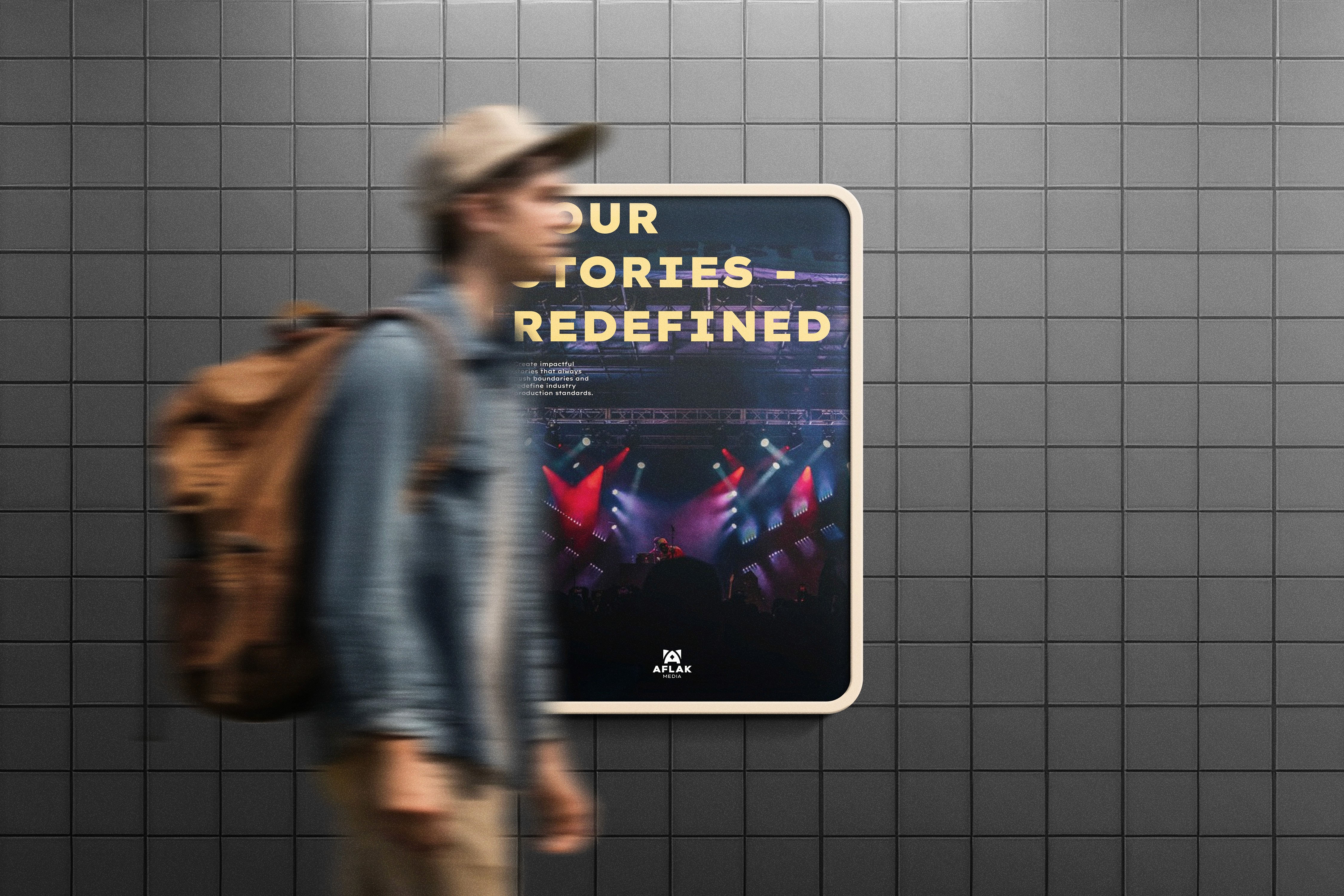
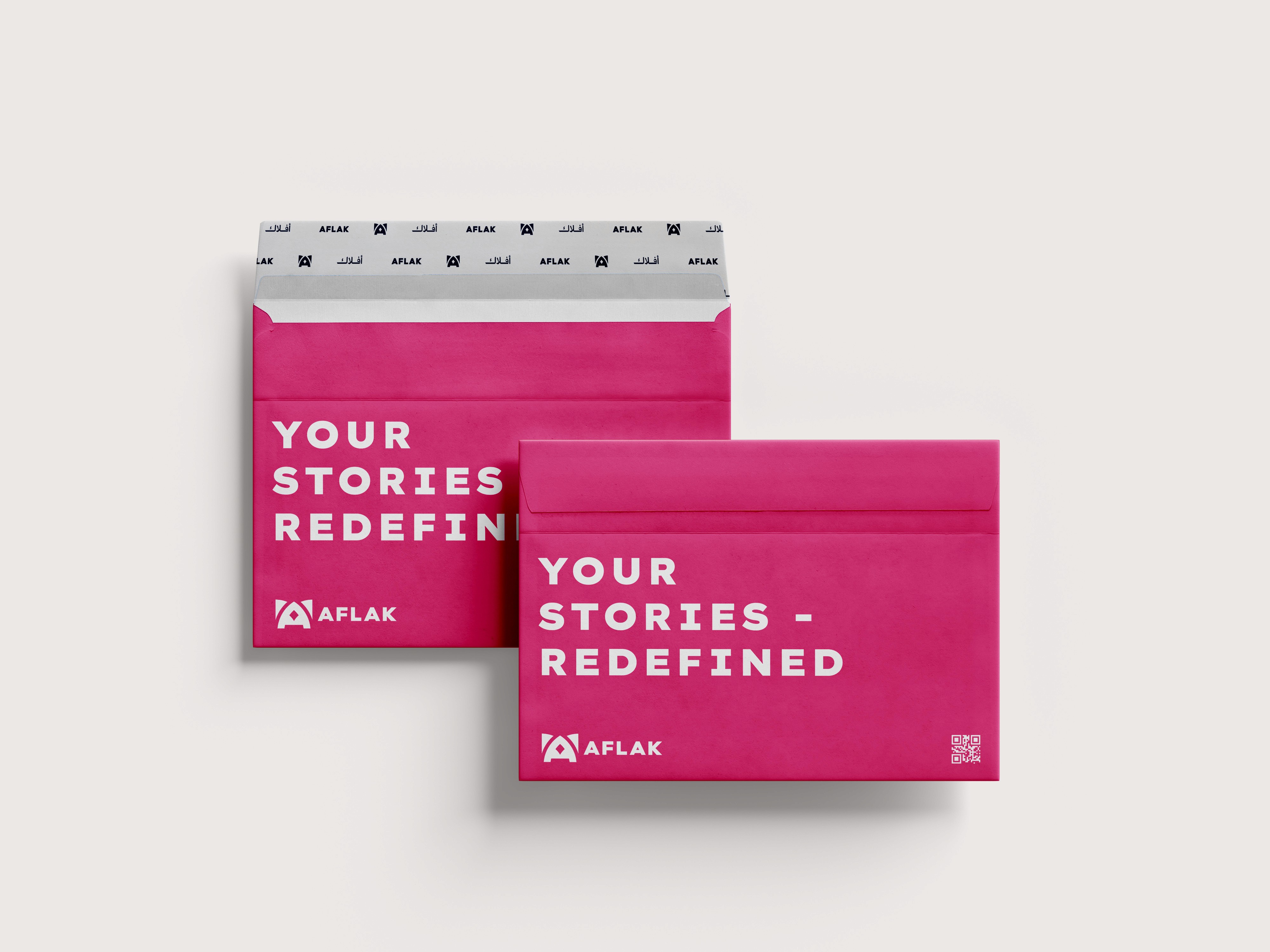
Aflak Media, a Vancouver-based media company, sought a refreshed brand identity that reflects its storytelling-driven approach while being professional, approachable, and engaging. I led the creative direction of the rebrand, crafting a cohesive visual identity through logo design, typography, color strategy, and brand guidelines.


LOGO.
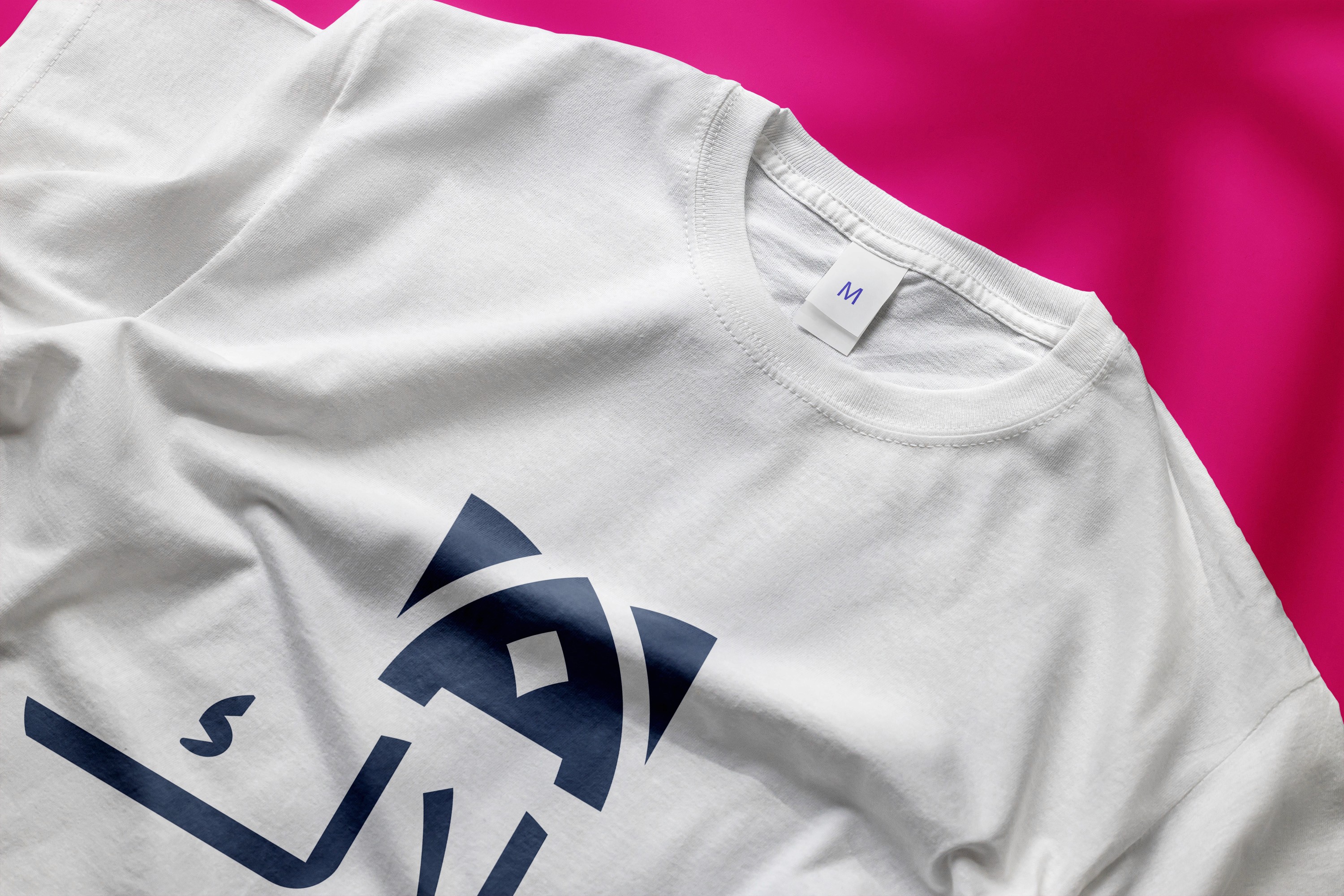
The Aflak Media logo is designed to reflect the concept of orbits, inspired by the meaning of "Aflak" while incorporating elements of videography and media production. The intersecting lines represent the dynamic nature of storytelling and the brand’s connection to diverse communities. The central “A” subtly resembles both a play button and an Islamic arch, symbolizing Aflak's work with Islamic organizations. This thoughtful combination of symbolism makes the logo visually engaging and relevant to Aflak Media’s identity.


ICONS.
A balance between simplicity and uniqueness. Initially, I experimented with more complex, generic icons but shifted towards a streamlined, distinct style that aligns with Aflak's brand identity. Each icon represents key aspects of media production, using clean lines and bold colors to ensure versatility and brand consistency across platforms.
T
Y
P
O
G
R
A
P
H
Y
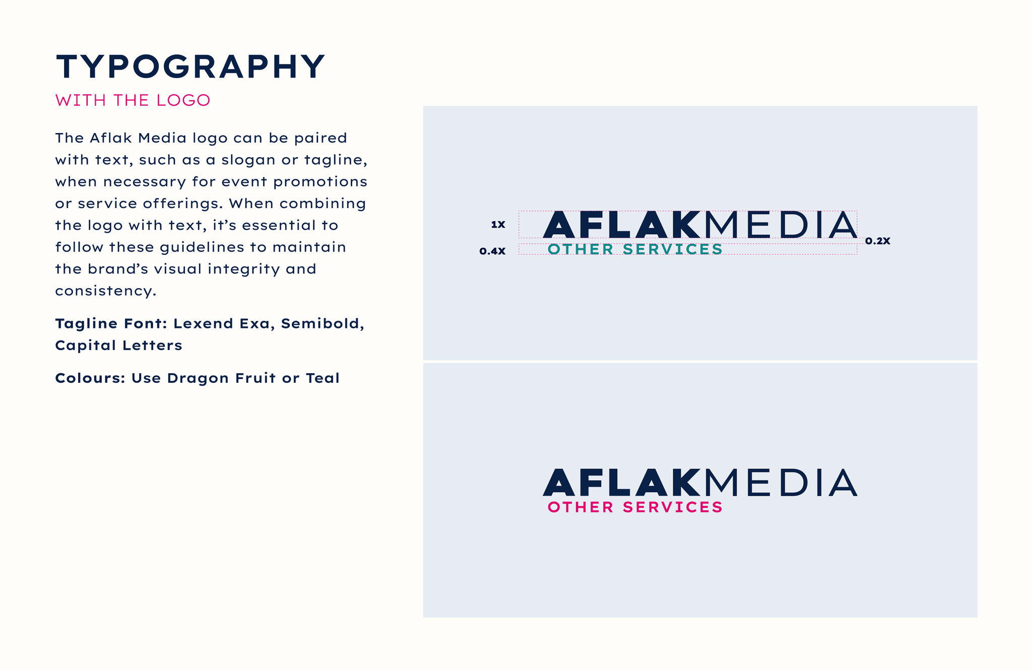
TYPEFACE: LEXEND EXA
I chose Lexend Exa as the primary typeface because of its exceptional readability and modern design. Its clean, open letterforms align perfectly with Aflak’s commitment to creating accessible and engaging content for diverse audiences.
The font’s simplicity and professionalism complement the brand’s visual identity, ensuring clarity across digital and print mediums while maintaining a contemporary, approachable feel.


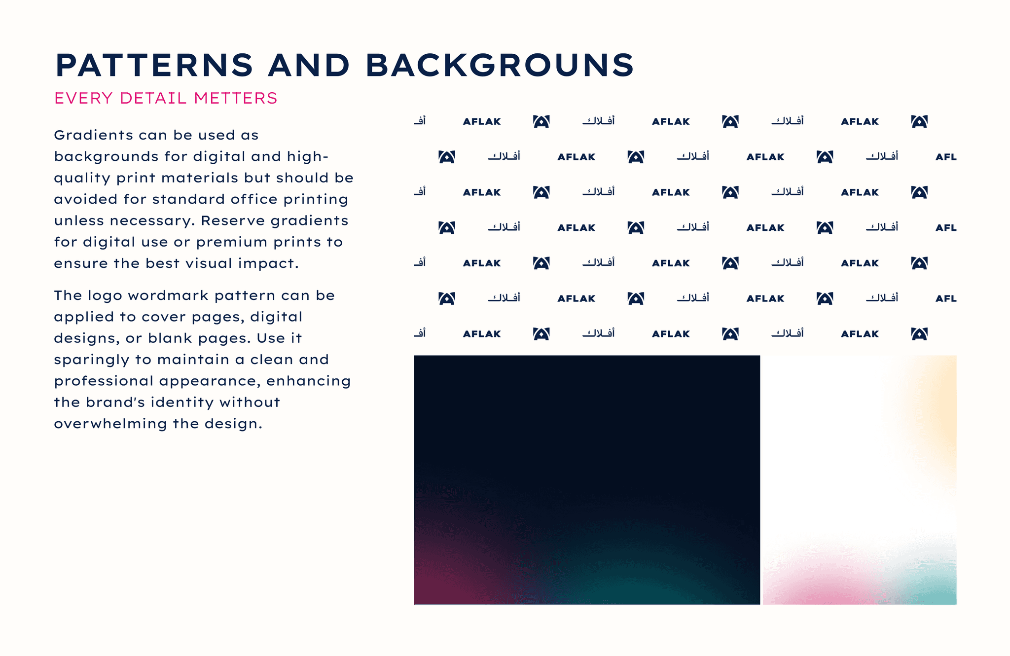


BRAND GUDELINES.
Comprehensive, 27-page resource designed to ensure consistent, professional representation of the brand across all media. This guide is essential for maintaining visual coherence, as it sets clear standards for logo usage, colors, typography, imagery, and graphic assets. By following these guidelines, we protect the integrity of Aflak’s brand identity, reinforcing recognition and trust among our audience. The process of creating this document involved careful consideration of Aflak's values, mission, and aesthetic vision, culminating in a practical tool that aligns all creative outputs with the brand’s core principles.